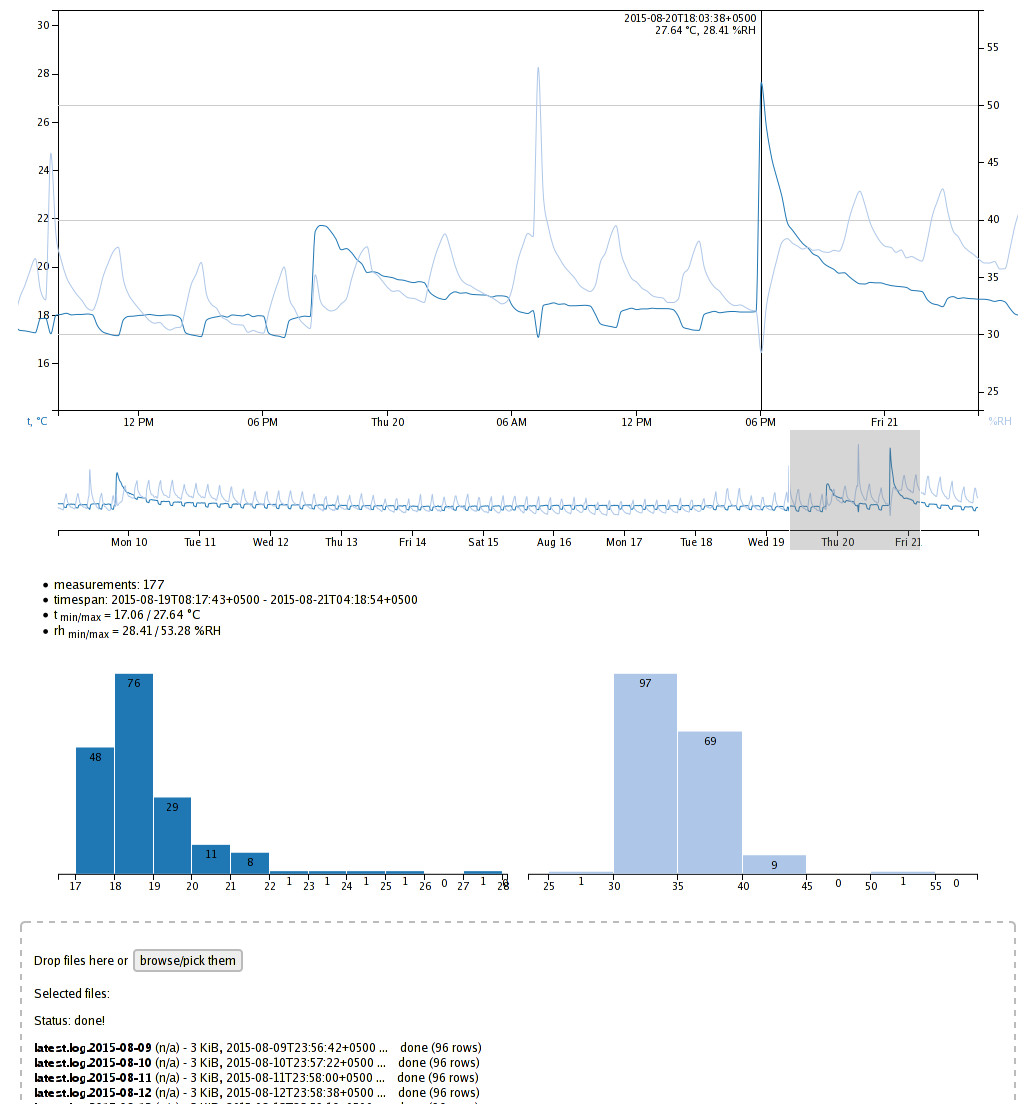
D3 chart for common temperature/rh time-series data
More D3 tomfoolery!
It's been a while since I touched the thing, but recently been asked to make a simple replacement for processing common-case time-series from temperature + relative-humidity (calling these "t" and "rh" here) sensors (DHT22, sht1x, or what have you), that's been painstakingly done in MS Excel (from tsv data) until now.
So here's the plot:

Misc feats of the thing, in no particular order:
- Single-html d3.v4.js + ES6 webapp (assembed by html-embed script) that can be opened from localhost or any static httpd on the net.
- Drag-and-drop or multi-file browse/pick box, for uploading any number of tsv files (in whatever order, possibly with gaps in data) instantly to JS on the page.
- Line chart with two Y axes (one for t, one for rh).
- Smaller "overview" chart below that, where one can "brush" needed timespan (i.e. subset of uploaded data) for all the other charts and readouts.
- Mouseover "vertical line" display snapping to specific datapoints.
- List of basic stats for picked range - min/max, timespan, value count.
- Histograms for value distribution, to easily see typical values for picked timespan, one for t and rh.
Kinda love this sort of interactive vis stuff, and it only takes a bunch of hours to put it all together with d3, as opposed to something like rrdtool, its dead images and quirky mini-language.
Also, surprisingly common use-case for this particular chart, as having such sensors connected to some RPi is pretty much first thing people usually want to do (or maybe close second after LEDs and switches).
Will probably look a bit further to make it into an offline-first Service Worker app, just for the heck of it, see how well this stuff works these days.
No point to this post, other than forgetting to write stuff for months is bad ;)