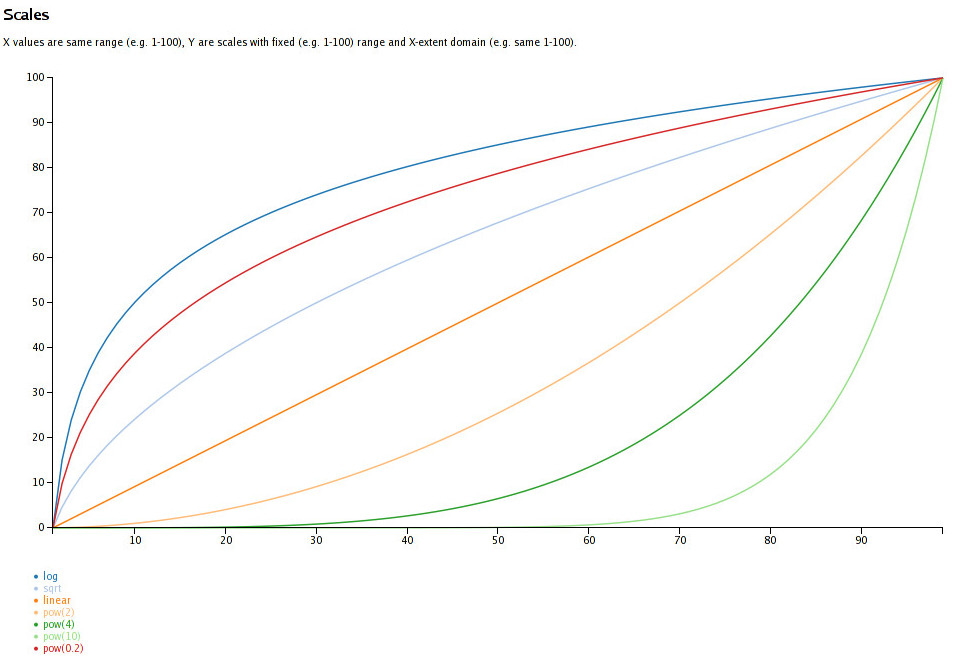
X-Y plots of d3 scales and counter-intuitive domain/range effect
As I was working on a small d3-heavy project (my weird firefox homepage), I did use d3 scales for things like opacity of the item, depending on its relevance, and found these a bit counter-intuitive, but with no readily-available demo (i.e. X-Y graphs of scales with same fixed domain/range) on how they actually work.
Basically, I needed this:

I'll be first to admit that I'm no data scientist and not particulary good at math, but from what memories on the subject I have, intuition tells me that e.g. "d3.scale.pow().exponent(4)" should rise waaaay faster from the very start than "d3.scale.log()", but with fixed domain + range values, that's exactly the opposite of truth!
Here, it's obvious that if you want to pick something that mildly favors higher X values, you'd pick pow(2), and not sqrt.
Feel like such chart should be in the docs, but don't feel qualified enough to add it, and maybe it's counter-intuitive just for me, as I don't dabble with data visualizations much and/or might be too much of a visually inclined person.
In case someone needs the script to do the plotting (it's really trivial though): scales_graph.zip